Showing posts with label dolltronic. Show all posts

Monday, 29 March 2010

Completed project - a layout for my web portfolio


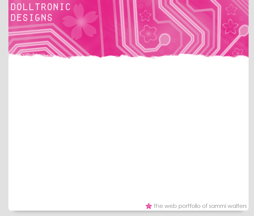
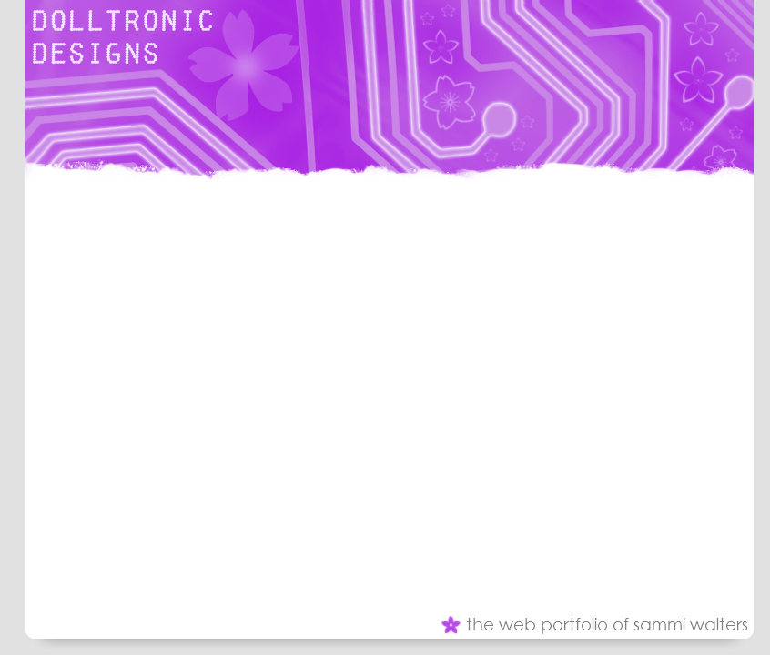
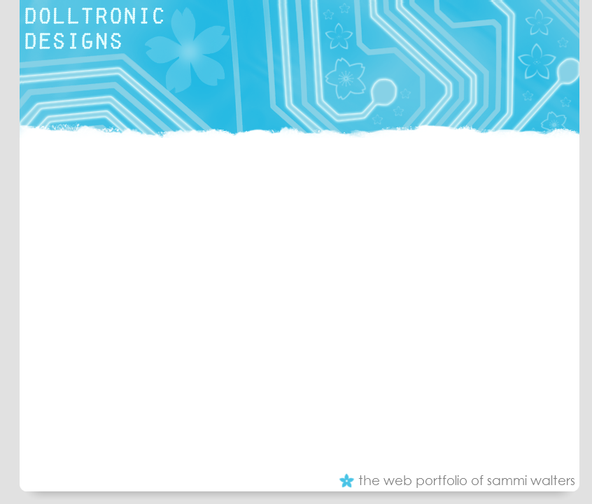
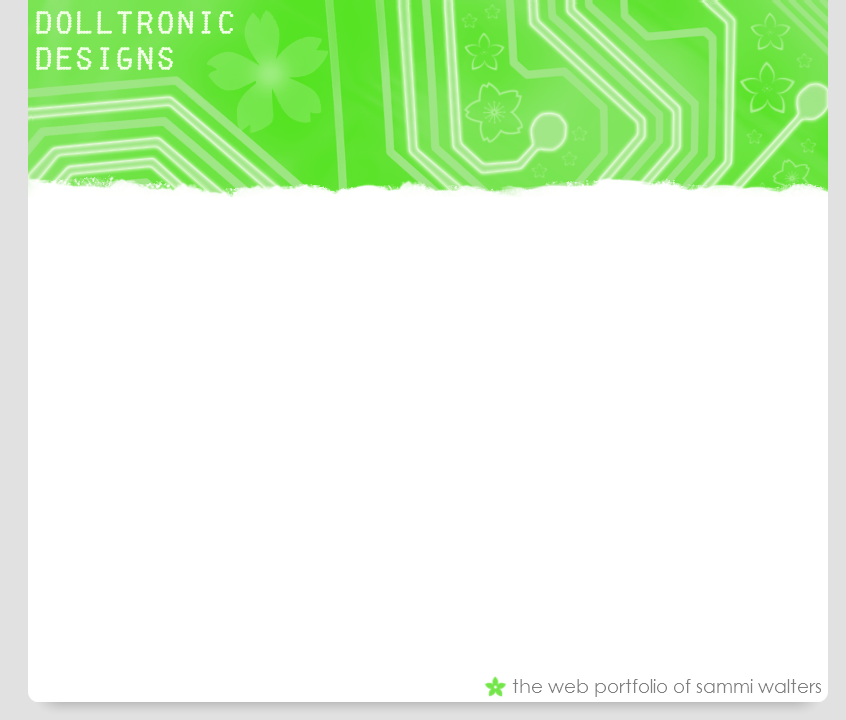
These are the final colour versions of my layout for my web design portiofolio. The only thing that is missing from this layout is the navigation tabs which will be added vertically down the left hand side of the layout.

This is because, from what I've learn studying HCI, the users look at the left side of a webpage first which is also why the name of my site is in the top left hand corner.

I really like my layouts, they are fun and colourful but simple at the same time. The header contains a circuitry board design in which some of the tracks have been made to glow using Adobe Photoshop CS4. Brushes were also used to add cherry blossom flowers to the image to make it more girly. Brushes were also used at the bottom of the header image to make it appear 'torn'.

The font used for the logo in the corner is called 'Fake Reciept' which I found using google while looking for 'futuristic fonts'. I liked that it was all in capitals, I think it contrasts nicely with the website.

Colourwise I prefer the
pink and the purple layouts as I think these are neither too bright or too dark. I like the turquoise but I think the detailing is difficult to see because there isn't as much contrast. I don't like the lime green at all and will not be using this version of the layout.

Overall I really like my design, I think it say's something about the image I'm trying to creative, fun, girly, technical, creative and stylish. I don't think my layout is overcrowded and I think the grey with the other colours works well.

I usually make a lot of my websites dark even though I know a white page is best. I do this because I think bright colours stand out on a dark backgorund better. However, I've managed to make my site colourful and it will be easy to read at the same time.


This my layout h
ow it would appear on the web. As you can see, I designed a logo for my site after all which is the image on the right. It says 'DD (dot)net' which stands for dolltronic-designs.net which will be the URL of my site when I register the domain name. It features the same font that is on the banner and the cherry blossom brushes I used.

Changes in the design of my web portfolio

Over the last few days I have changed my mind about how I would like my website to look.

I have decided that I will no longer be using the logo I designed and instead I will have a graphical header image displaying the words "Dolltronic Designs". Using my research I will keep the theme the same, girly and technical. I have decided that the header image will incorporate a circuit board and brushes will be used to add cherry blossom flowers to it.

I have also decided that all pages will have the same colour scheme which is hot pink, white and grey for the home page then violet, turquoise and lime green for the others. I have chosen these colours because they are my favourite and represent me as a person and also for the symbolism of the colours.

The reason behind this change is because I want to keep the website simple and clean while still being creative and professional and I came to the conclusion that the logo I designed wouldn't work well with this theme. I feel I can still keep this website professional and creative (if not more so) using the new design.

Wednesday, 3 March 2010

Analysis of a business name

Yesterday I decided that I would design a logo for my project. This would be for 'Dolltronic Designs' - an idea I had for a website to showcase my web design work, a web design portfolio if you will.

I've had the username 'Dolltronic' across many different sites over the past four years now. I chose it because many of my friends call me 'doll' and I like how girly it sounds as I am a girly girl. :) The 'tronic' part is derived from 'electronic' because I've always had an interest in technology and my favourite type of music is electronic.

I want the logo for this website to symbolise who I am and the word 'dolltronic', so I asked my three closest friends to tell me what they thought of when they hear my username. Their answers were:
  • Barbie
  • Cute
  • Girly
  • Computers
  • Electricity
  • Circuit boards
Using the opinions of my friends who are all novice computer users, I am going to create a logo which is girly and technical. I'm thinking of silhouettes of dolls and circuitry patterns.