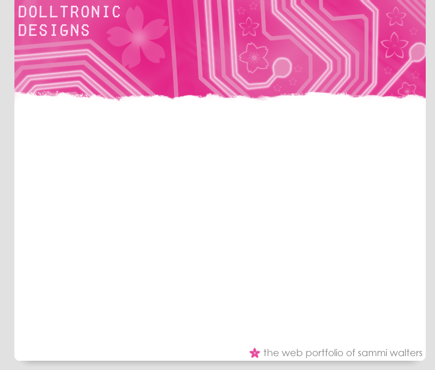
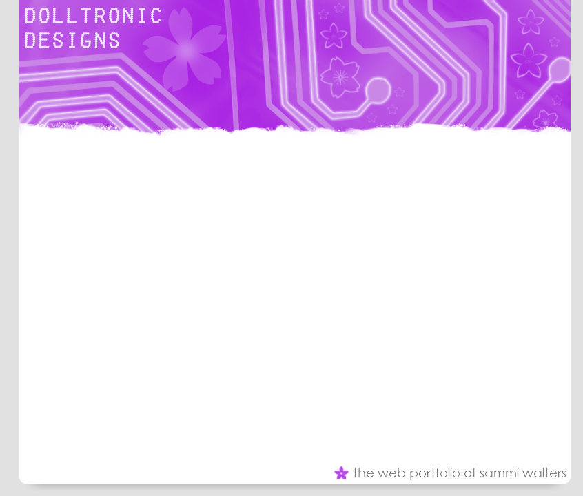
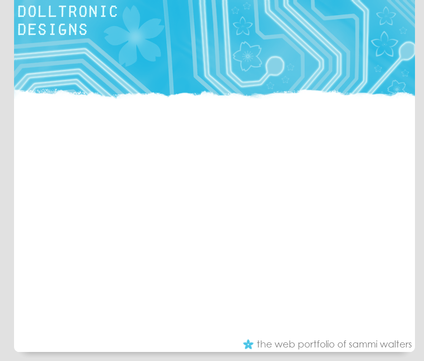
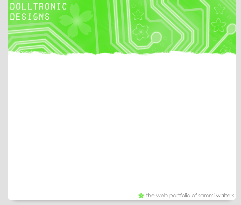
These are the final colour versions of my layout for my web design portiofolio. The only thing that is missing from this layout is the navigation tabs which will be added vertically down the left hand side of the layout.
This is because, from what I've learn studying HCI, the users look at the left side of a webpage first which is also why the name of my site is in the top left hand corner.
I really like my layouts, they are fun and colourful but simple at the same time. The header contains a circuitry board design in which some of the tracks have been made to glow using Adobe Photoshop CS4. Brushes were also used to add cherry blossom flowers to the image to make it more girly. Brushes were also used at the bottom of the header image to make it appear 'torn'.
The font used for the logo in the corner is called 'Fake Reciept' which I found using google while looking for 'futuristic fonts'. I liked that it was all in capitals, I think it contrasts nicely with the website.
Colourwise I prefer the pink and the purple layouts as I think these are neither too bright or too dark. I like the turquoise but I think the detailing is difficult to see because there isn't as much contrast. I don't like the lime green at all and will not be using this version of the layout.
Overall I really like my design, I think it say's something about the image I'm trying to creative, fun, girly, technical, creative and stylish. I don't think my layout is overcrowded and I think the grey with the other colours works well.
I usually make a lot of my websites dark even though I know a white page is best. I do this because I think bright colours stand out on a dark backgorund better. However, I've managed to make my site colourful and it will be easy to read at the same time.
This my layout how it would appear on the web. As you can see, I designed a logo for my site after all which is the image on the right. It says 'DD (dot)net' which stands for dolltronic-designs.net which will be the URL of my site when I register the domain name. It features the same font that is on the banner and the cherry blossom brushes I used.
Over the last few days I have changed my mind about how I would like my website to look.
I have decided that I will no longer be using the logo I designed and instead I will have a graphical header image displaying the words "Dolltronic Designs". Using my research I will keep the theme the same, girly and technical. I have decided that the header image will incorporate a circuit board and brushes will be used to add cherry blossom flowers to it.
I have also decided that all pages will have the same colour scheme which is hot pink, white and grey for the home page then violet, turquoise and lime green for the others. I have chosen these colours because they are my favourite and represent me as a person and also for the symbolism of the colours.
The reason behind this change is because I want to keep the website simple and clean while still being creative and professional and I came to the conclusion that the logo I designed wouldn't work well with this theme. I feel I can still keep this website professional and creative (if not more so) using the new design.
Purpose of the website
The website is a web design portfolio to showcase my work under the name 'Dolltronic Designs'. The website is to contain:
- Introduction to the website
- Details and examples of past projects
- About myself, my experience, skills and education
- Different ways of contacting me
Who is the website aimed at?
The website is mainly aimed at businesses who are thinking of having a website to promote. However a small number of clients may request a personal site.
I chose my colourful design to attract creative businesses rather than corporate because I enjoy making colourful and interesting sites.
Points to consider
- Text needs to be clear, to the point and a reasonable size
- Website needs a clean, simple but not boring layout. The website needs to easy to navigate but not boring to the eye.
- Website needs to showcase my work in the best light
Software tools
- Notepad for writing HTML and CSS
- Corel Paint Shop Pro 9 and Adobe Photoshop CS4 for image editing
- Internet Explorer and Mozilla Firefox browsers to test layout
Testing website in various browsers ensures that all types of potential clientèle can see the website properly. It is also a good idea to test the layout in various screen resolutions. I will be doing a liquid layout to combat resolution problems.
Navigation
Will be tabs to the left and vertical. Appropriate colours on hover. They will have a raised appearance on mouseover.
Colour scheme
The layout won't be too graphics intensive to increase performance. Each page will have a header image that changes colour on each page. The home page will be hot pink, the web design page will be violet, the about me page will be turquoise and the contact page will be lime green.
The header image will consist of the logo I designed as shown in a previous blog entry and a background of cherry blossom flowers with a circuitry design.
Colour is very important in web design, and can be used to add spice to your website, relay the mood of a page, as well as to emphasize sections of a site. If you think about it, as soon as you look at a website, you can normally guess within seconds what that site is all about. Just like we all are quick to judge other people by their appearance, and surroundings by the way they smell, look, and feel, we also judge a website by its colour scheme and style of design. We can usually tell almost immediately, whether a website is corporate, personal, whether it is for kids, teens, or just for adults, etc. Most of this information is perceived solely by taking in colour and design elements. [1]
Colour relationships are how colours work together. There are different types of mixing and matching colours. I won't be mixing and matching colours for my portfolio but I will post the types of colour relationships for the purpose of this blog:
- Adjacent or harmonizing colours appear next to each other on the color wheel. Harmonizing colours often work well together but if too close in value they can appear washed out or not have enough contrast. A harmonizing trio could be something like blue, light blue, and cyan or perhaps red, orange, and yellow.[2]
Contrasting colours are separated from each other by other colours -- they come from different segments of the colour wheel. The further apart, the more the contrast. Red (from the warm half of the colour wheel) contrasts with green and blue (from the cool half of the colour wheel). Shades of purple contrast with shades of green. Contrasting colours that are directly opposite each other on the colour wheel may be described as clashing colours -- see the description for complementary. Despite the name, colours that clash are not always a bad combination if used carefully. They provide great contrast and high visibility. [2]- Complementary colours are on opposite sides of the colour wheel -- they are each half of a pair of contrasting colours. For example, blue is a complementary colour to yellow. Green is complementary to purple and magenta. A pair of complementary colours printed side by side can sometimes cause visual vibration (clash) making them a less than desirable combination. However, separate them on the page with other colours and they can work together. Note the spelling. These are not complimentary colours. They don't always flatter (compliment) one another but they do complete (complement) each other. [2]
What I will be concentrating on however is the psychology of colour and how it makes people feel. I am concentrating on this because each of my pages will have a different colour scheme.
- Blue: Blue is first and foremost a calming colour, one that promotes physical and mental relaxation, inner security and confidence. Light blue promotes creativity. That is why it is recommended to decorate offices and studies. Ideally, it should be associated with yellow, which stimulates the mind and raises one's organizational capacity. Turquoise seems to facilitate communications between people who surround themselves in it. [3]
- Yellow: Yellow is bright, happy and stimulating. It is associated with intellect and the expression of thoughts. [3]
- Orange: Orange is the "happy" colour par excellence. It frees emotions, promotes self-esteem and the capacity to forgive. This stimulating colour fights depression and cultivates good humour. Lighter hues such as peach and apricot, help restore nervous energy. [3]
- Red: Colour influences our emotions and psychological state too. Red is a very powerful colour, associated with a high level of energy and stimulation. It goes hand in hand with adjectives such as courageous, antidepressant, assertive, determined, friendly, warm, and sensual. On the other hand, too much of some reds can make people feel irritable, impatient and even angry.[3]
- Green: Green stands as a symbol of life, growth and harmony. It brings us comfort, relaxation and wellness. When we think of green, we imagine many of nature's offerings such as forests, trees, grass, olives, apples, lichen, jade and emerald. Green's strong link with nature seems to bring us closer to nature and to one another. [3]
- Violet: According to psychologists, violet contributes to mental equilibrium. In addition, it is associated with a sense of the artistic, music, intuition and spirituality. It promotes sensitivity and compassion. [3]
- Black: Black creates diverse characteristics: it provides a feeling of protection, comfort, and yet, a sensation of mystery. It is associated to silence, infinity as well as to the feminine vital force. [3]
For my web portfolio I have decided to do the home page pink as it is my favourite colour and represents me. For the other pages, I will use lime green as it brings comfort to the user. I will use turquoise for the calming effect and because it promotes creativity. Lastly, I will use violet because it is associated with art.
References- Unknown. (). A guide to Combining Colors & Color Schemes for Great Web Design. Available: http://www.allwebdesignresources.com/webdesignblogs/graphics/webdesigncolorcombinationsguide/. Last accessed 17 March 2010.
- Jacci Howard Bear. (). Color Meanings - Symbolism of Color and Colors That Go Together. Available: http://desktoppub.about.com/cs/color/a/symbolism.htm. Last accessed 17 March 2010.
- Unknown. (). The Theory of Colour - Colour Psychology. Available: http://www.paintcafe.com/en/couleur/langage/psychologie/index.asp. Last accessed 17 March 2010.